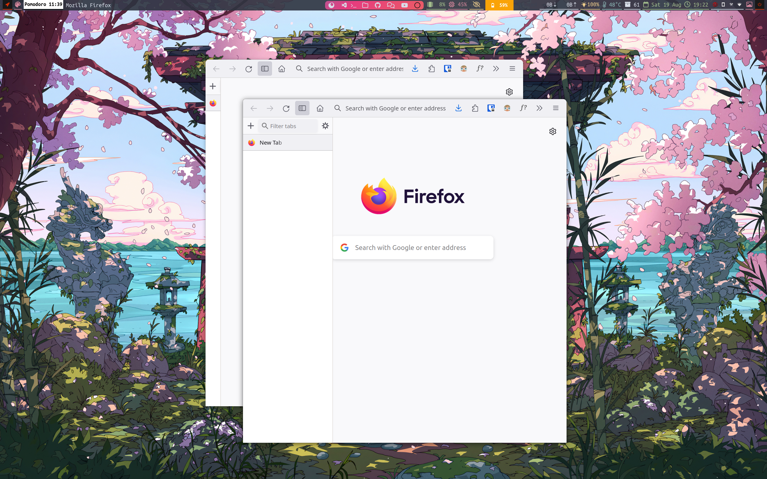
I dont think it should be default. Personally I think tabs on right click might even be smarter since I would not have to move the mouse so far. Yes, I don't horde tabs. I never understood how to handle tabs without the title. So I never have more than 10 tabs.
Firefox
A place to discuss the news and latest developments on the open-source browser Firefox
I definitely prefer Firefox as it is now to that.
I'm not sure why Firefox must look like a GNOME app by default. IMHO, looks really bad.
Also, how am I supposed to move this window?
And I've never looked at Firefox's tab bar and thought, this UI element really needs to occupy a lot more screen space.
The chunk of screen space lost to that tabs window wouldn't be as big a deal if the windows were maximised, but there's no button for that now either.
I don't think the missing maximise button is intentional. They seem to be using a minimal (Linux) window manager and it's quite common for those folks to use keyboard shortcuts for maximising, closing etc., so they probably didn't have those window buttons even before starting that redesign...
