this post was submitted on 05 Apr 2024
922 points (98.4% liked)

Memes

45173 readers
1456 users here now

Rules:

  1. Be civil and nice.
  2. Try not to excessively repost, as a rule of thumb, wait at least 2 months to do it if you have to.

founded 5 years ago
MODERATORS
 
top 50 comments
sorted by: hot top controversial new old
[–] [email protected] 85 points 5 months ago* (last edited 5 months ago) (9 children)

Can someone please Photoshop it and fix the keming

[–] [email protected] 73 points 5 months ago (5 children)
load more comments (5 replies)
[–] [email protected] 58 points 5 months ago (1 children)
[–] [email protected] 4 points 5 months ago
[–] [email protected] 6 points 5 months ago* (last edited 5 months ago) (2 children)

Huh. Weird. You made that comment. I didn't. sometimes my Lemmy glitches after I leave a comment it does things like this to me:

instead of posting my comment, it posts my username over somebody else's comment 🤔 It's a temporary glitch and It fixes itself after I exit then come back. I captured that screenshot to get evidence of the glitch before it fixed itself.

load more comments (2 replies)
load more comments (6 replies)
[–] [email protected] 68 points 5 months ago (8 children)

Chinchilla in Russian cursive:

[–] [email protected] 29 points 5 months ago (1 children)
[–] [email protected] 24 points 5 months ago (1 children)

I don't know why that weird ass little gross thing is so appropriate but that is probably the best possible response lol.

[–] [email protected] 5 points 5 months ago

Uma! He's a character from the Witcher 3.

[–] [email protected] 12 points 5 months ago* (last edited 5 months ago) (1 children)

Does Russian "chinchilla" begin with a ч? Or a ш?

If it starts with a "ch" sound as in "ч," chinchilla would look like this:

[–] [email protected] 9 points 5 months ago

Its шиншилла

[–] [email protected] 8 points 5 months ago

Well yeah, but it's not a calligraphy, it's just bad writing (and cursed word).

[–] [email protected] 4 points 5 months ago* (last edited 5 months ago)

You can do it better, or use a nice font for your writings

https://www.calligrapher.ai

load more comments (4 replies)
[–] [email protected] 50 points 5 months ago

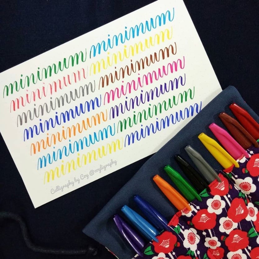
This is actually a thing. When learning calligraphy, it was one of the exercises we did. If you have good enough control of your hand and pen, then all strokes should be the same length, slanted the same way, and separated by the same spacing. When you manage this apparent “unreadable” thing, it means you nailed it!

The example below comes from this site (not mine)

https://arendo.com.ph/events/copperplate-script-brushpen-calligraphy/

[–] [email protected] 31 points 5 months ago (1 children)

The first thing that popped into my head when I saw that "fence" is Tengwar:

The elves must really hate dyslexics

[–] [email protected] 12 points 5 months ago (1 children)

the first thing that popped into my head was Russian cursive.

[–] [email protected] 17 points 5 months ago* (last edited 5 months ago) (2 children)

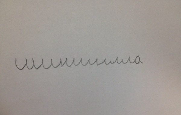
Ha, true, it can be almost as hairy as Tengwar especially if you write nonsense. Quick, name all the letters:

edit: made it worse

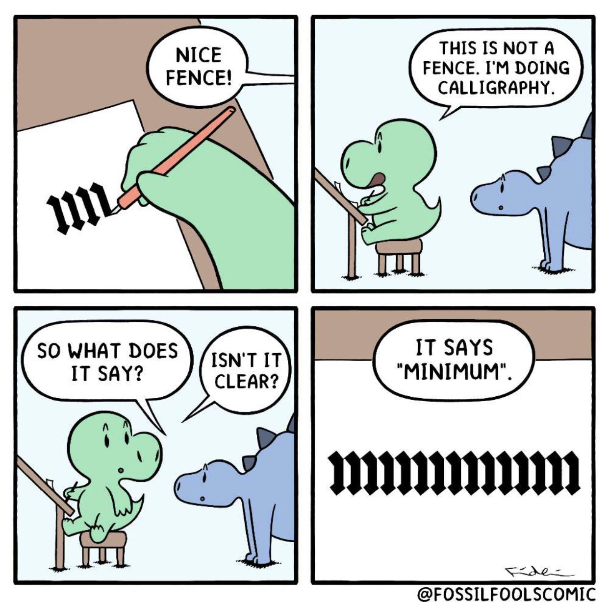
revenge of the edit: "minimum" isn't exactly easy to read either:

load more comments (2 replies)
[–] [email protected] 29 points 5 months ago (1 children)
[–] [email protected] 4 points 5 months ago

Well played

[–] [email protected] 18 points 5 months ago (1 children)
[–] [email protected] 9 points 5 months ago* (last edited 5 months ago) (1 children)

no its actually munimim. please dont comment if you dont know what you're talking about

[–] [email protected] 12 points 5 months ago (1 children)

I think you arw getting downvoted because people have misread your comment and think you didnt get my joke. The irony being that you clearly did get my joke and actually joined in on the joke with your comment. I think your spelling is too much like typoglycemia.

[–] [email protected] 3 points 5 months ago* (last edited 5 months ago) (1 children)

lol probably. eh as long as u got it :)

also what's typoglycemia

load more comments (1 replies)
[–] [email protected] 11 points 5 months ago

Do they not dot their i's in calligraphy?

[–] [email protected] 10 points 5 months ago (1 children)
[–] [email protected] 8 points 5 months ago* (last edited 5 months ago)

Also nice the calligraphy used in Germany until 1941, the Sütterlinschrift

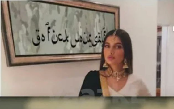
But one of the best is arabic calligraphy (I think that I can even read it ¬¬)

[–] [email protected] 7 points 5 months ago

New metal band font dropped.

[–] [email protected] 5 points 5 months ago
[–] [email protected] 5 points 5 months ago

For a second there, I saw it. Now it's just a fence again.

[–] [email protected] 4 points 5 months ago

Russian cursive

[–] [email protected] 4 points 5 months ago

eschew obfuscation

load more comments
view more: next ›