this post was submitted on 12 Nov 2023
578 points (94.3% liked)
linuxmemes
21263 readers
494 users here now
Hint: :q!
Sister communities:
- LemmyMemes: Memes
- LemmyShitpost: Anything and everything goes.
- RISA: Star Trek memes and shitposts
Community rules (click to expand)
1. Follow the site-wide rules
- Instance-wide TOS: https://legal.lemmy.world/tos/
- Lemmy code of conduct: https://join-lemmy.org/docs/code_of_conduct.html
2. Be civil
- Understand the difference between a joke and an insult.
- Do not harrass or attack members of the community for any reason.
- Leave remarks of "peasantry" to the PCMR community. If you dislike an OS/service/application, attack the thing you dislike, not the individuals who use it. Some people may not have a choice.
- Bigotry will not be tolerated.
- These rules are somewhat loosened when the subject is a public figure. Still, do not attack their person or incite harrassment.
3. Post Linux-related content
- Including Unix and BSD.
- Non-Linux content is acceptable as long as it makes a reference to Linux. For example, the poorly made mockery of
sudoin Windows. - No porn. Even if you watch it on a Linux machine.
4. No recent reposts
- Everybody uses Arch btw, can't quit Vim, and wants to interject for a moment. You can stop now.
Please report posts and comments that break these rules!
founded 1 year ago
MODERATORS
you are viewing a single comment's thread
view the rest of the comments
view the rest of the comments

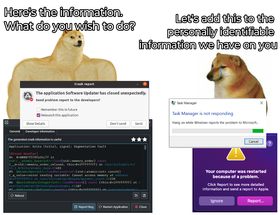
On MacOS if you click on the "Report..." button it expands to something similar to what you see on the left.
I don’t understand why the macOS way is “bad.” You choose whether to send it to the developer after reviewing the information. When I review the information, I rarely see any personally identifiable information.
I'm pretty sure this only goes to Apple, not to the actual developer.
I believe I've even seen devs specifically ask for copies of the reports from the crash reporter, as they wouldn't receive them otherwise.
this doesn't change the rest of your statement though, just afaik the recipient is different.
I know that at least App Store apps are signed by the developer so I always assumed it would go to them.
That’s super weird if Apple is collecting this but not passing it on — it would be in their interest for the developer to be able to fix their app.
based on https://help.apple.com/xcode/mac/current/#/deve2819c518 it seems like users may need to explicitly enable sharing crash data with app developers.
I don't know what the default for this is.
https://help.apple.com/xcode/mac/current/#/dev9a80ab71d seems to imply that you need to distribute your app via app store or testflight to be able to receive crash reports.
the majority of apps installed on my mac are not installed via app store, though many of them have app store variants.
i don't know if the distribution channel matters or just having the app in app store is enough.
this article however also explicitly states this, so it appears that you do indeed by default not send this data to app developers:
thanks! never clicked that for fear that they'd do something similar to windows.
I'll try it next time it comes up.
maybe there should be a third button for less confusion? or does it go against apple's "design" principles? :p
To demonstrate I got an app to crash, this is what you see when you click on the report button. The report is longer, trying to show where the app crashed, at the bottom there's a button to send a report to apple
looks much better than what I'd thought. thanks for sharing mate! BTW, the interface is in French, right?
Yes, on the bottom it says on the left to hide the details, and on the right don't send and send to apple.
update: doesn't have button on my machine.
just two buttons: show/hide details, and report. can't even go back or close it.
I think it's fine as is. Three dots after a button / menu item imply more interaction is required before an action is taken.
"Intuitive" design