this post was submitted on 18 Dec 2024
849 points (98.5% liked)
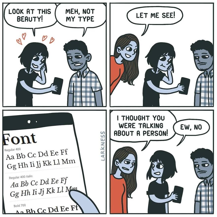
Comic Strips
13641 readers
3397 users here now
Comic Strips is a community for those who love comic stories.
The rules are simple:
- The post can be a single image, an image gallery, or a link to a specific comic hosted on another site (the author's website, for instance).
- The comic must be a complete story.
- If it is an external link, it must be to a specific story, not to the root of the site.
- You may post comics from others or your own.
- If you are posting a comic of your own, a maximum of one per week is allowed (I know, your comics are great, but this rule helps avoid spam).
- The comic can be in any language, but if it's not in English, OP must include an English translation in the post's 'body' field (note: you don't need to select a specific language when posting a comic).
- Politeness.
- Adult content is not allowed. This community aims to be fun for people of all ages.
Web of links
- [email protected]: "I use Arch btw"
- [email protected]: memes (you don't say!)
founded 2 years ago
MODERATORS
you are viewing a single comment's thread
view the rest of the comments
view the rest of the comments
verdana is great for small sizes on screen. it was designed specifically for that purpose so it would look good with pixellation. it's probably the most successfully designed Microsoft font to date. if you want to type anything in like 5-6pt font verdana is a great choice. but that also makes it bulky and inelegant at larger font sizes.
if you want a sans serif default ms font to use in larger sizes the segoe font family is pretty good.
The biggest factor for me with fonts is readability (I have my notepad++ default to verdana at 16pt font on a 1080p monitor which is my ideal). It's probably worth mentioning that my eyesight isn't great and I think I have some kind of brain related trouble with print.
Segoe is okay, but the font is really thin and the spacing is too narrow for me.
yeah I said for big sizes. 16 is more mid, and not perfect for segoe's thin lines. i think verdana is still a bit too bulky for 16 but for any kind of vision impairment it should be great. you might want to try trebuchet. another low contrast default ms font but it's a bit more humanist and pleasing to look at in those sizes.