this post was submitted on 17 Oct 2024
178 points (87.7% liked)
movies
1697 readers
231 users here now
Warning: If the community is empty, make sure you have "English" selected in your languages in your account settings.
A community focused on discussions on movies. Besides usual movie news, the following threads are welcome
- Discussion threads to discuss about a specific movie or show
- Weekly threads: what have you been watching lately?
- Trailers
- Posters
- Retrospectives
- Should I watch?
Related communities:
Show communities:
Discussion communities:
RULES
Spoilers are strictly forbidden in post titles.
Posts soliciting spoilers (endings, plot elements, twists, etc.) should contain [spoilers] in their title. Comments in these posts do not need to be hidden in spoiler MarkDown if they pertain to the title’s subject matter.
Otherwise, spoilers but must be contained in MarkDown.
2024 discussion threads
founded 1 year ago
MODERATORS
you are viewing a single comment's thread
view the rest of the comments
view the rest of the comments


If it was her decision that her full face should be on display, the backlash should be evidence enough that someone else gets paid to make those decisions, not her.
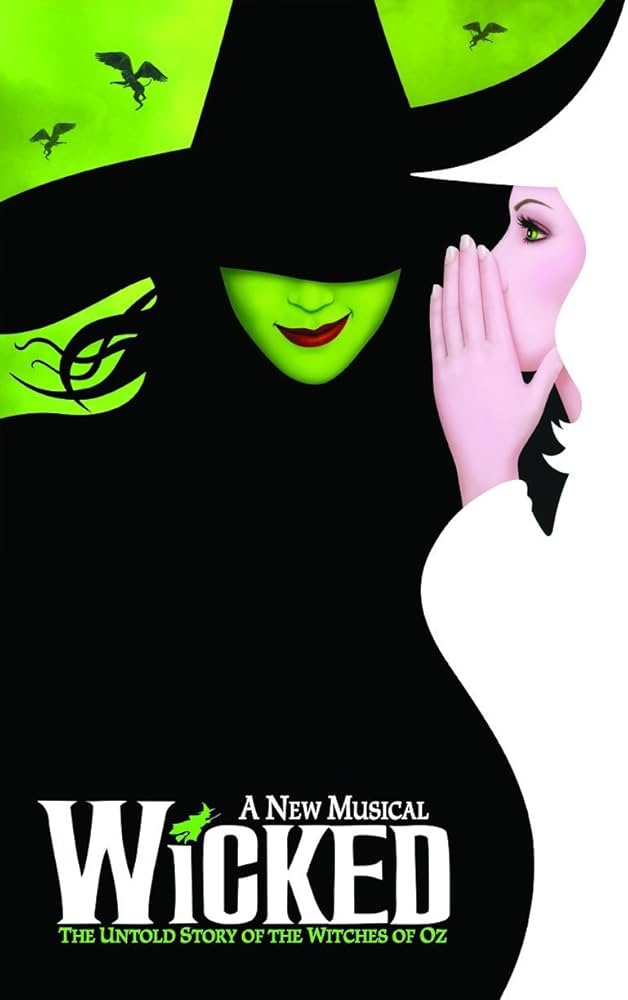
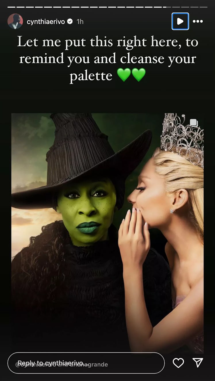
The original looks boring. She has absolutely no emotions on her face. There's no mystique, no 'wickedness'. Even the composition looks like something a high schooler in Photoshop class would make.
The edit isn't perfect either. But at least it pays homage to the original in more than just image. It adds that mystique back, and makes her look more menacing.
What it truly boils down to is ego. Although the edit is better, and so many people agree on it, it doesn't show her full face. And she can't let that go.
Guaranteed this whole thing came up before that it didn't match the style. She showed her cards and now makes it sound like she was the one who pushed against matching the original. Now that the fans see it and dislike it (probably like they warned that fans would), she's mad about it. It really sounds like she pushed for this design so it wouldn't hide her face and now she's furious that fans reacted in the exact way that was predicted.
The edit looks ridiculous, how is it better?
I'm not mixing this up right?
The first picture with the red lipstick is the fan made photo?
where you can't see half her face?
that is fucking weird.
The original looks so much better.
what are you talking about there's no emotions on her face?
in the fan edit they took away half her face!
this is crazy that people like the fan edit, It's like if you cut an origami crane in half, drew a smiley face on it with a Sharpie and you were like "yeah that's better."
The original's smile communicates much more stuff than the eyes on the face that looks like it's completely bored.
Trying to "communicate with her eyes" is exactly what makes the poster bad.
i disagree, but your interpretation of her eyes is your own and completely beside the point, in any case.
It's not besides the point. It's in fact the whole point. That's why there is a fan edit and a response and a backlash to the backlash.
All of this is the point here. You can't handwave away the other side cause you don't agree or want to handle that argument.
Her eyes look bored and like she's trying to look serious. Like she's worried you realized you can smell her last fart.
"All of this is the point here."
no, unless you are responding to somebody else, you are barking up a tree in a completely separate field.
"You can't handwave away the other side cause you don't agree or want to handle that argument."
I've swatted every insult and argument here so far without breaking a sweat because they have no standing or, like your comments, are completely irrelevant to my comments, what you might want to try reading before responding to.
what you think of her expression is completely immaterial and irrelevant to any of my comments.
maybe you think you're responding to somebody else?
you can think anything you like about her expression. whatever you like; it sounds like you like farts, so you're thinking about farts.
That's fine, and is completely irrelevant with respect to invalidating her own feelings of erasure.
that is what I have been addressing, and what most of you have completely whiffed on or shamefully been attacking her for.
I don't care how people see the poster, I care that people are not respecting her feelings at being erased from her own artwork.
it doesn't matter what you think of the artwork in the slightest.
it matters that you're disrespecting someone for expressing themselves, bullying someone because they are being sincere.
you're dehumanizing them because what they say makes you uncomfortable.
Her own artwork…. Movies are collaborations. She it a tiny but important part of the artwork not the entirety. Shit she’s like the sixth person playing the role. She created not much.
"She it a tiny but important part of the artwork..."
yes. and look how furious and contemptuous it has still made you that she has an opinion about her own work.
you claim she's so unimportant, so why is it that she deserves so much contempt and abuse from a dozen strangers in one post simply for expressing her opinion, without demanding change or attacking anyone.
No, I’m contemptuous of you. She’s foolish for feeling that way and you’re foolish for acting like she’s a victim. She’s the subject of fan art, boo fucking hoo. Not even rule34 fanart. Get off yourself.
"No, I’m contemptuous of you[wait for it]. She’s foolish for feeling that way[this is contempt]"
and yet you are insulting Cynthia. now that you realize how shameful that is, you're turning your tantrum on the person who pointed it out.
you aren't contemptuous of me, you're upset that I've called you out.
you are following the common emotional line of everyone else here who is insulting and dehumanizing her.
"She’s the subject of fan art, boo fucking hoo"
she got hurt and shared her feelings. that doesn't threaten you or affect your life, and yet you're furious at her.
kind of weird, huh? wonder what that says about you.
Wow. Ok.
You know you can make something and it still be bad right?
what do you need help with understanding here?
you need an example of someone that made "bad" art, you mean?
what does her expression tell you about her character?
ooh good question.
she has a very deliberate stare and a relaxed face, so it looks like she's hearing something she doesn't like that concerns her and she's deciding what to do about it.
I also see something vulnerable in there,, since the muscles around her eyes aren't very tense, but still a very earnest look.
hoping for understanding, with a little resignation to do what must be done.
she's nailing it with respect to her role, now that you bring it up.
you described almost every "resting face".
I thought the resting face was supposed to be aggressive or bitchy?
she doesn't really have those qualities in this expression.
no, that's called a "resting bitch face", not "resting face"
Resting *Witch Face
got it, I'm way out of common buzzword territory at this point.
buzzword or not, that is the expression all of us make when we're not making an expression. Eyes open, not tense, not smiling for no reason.
that is definitely not my resting face.
or most resting faces I'm familiar with.
you think Cynthia has a resting face in that official poster?
with that deliberate a stare and her eyes that wide open? The corner smile and eyebrow?
That's super weird from over here, but everyone sees something different, like with everything else.
no bigs.
what smile???
The small smile on her face I assume is a direct homage to the smile from the animated poster.
slight uptick in one corner of the mouth.
did any of you actually look at the official artwork poster with Cynthia on it?
various statements about her face are divorced from reality.
animated smile, camera right slightly raised corner of the mouth:
cynthia's smile, camera right slightly raised corner of the mouth:
yeah.... that's not a smile.
Tomato potato hombre.
its the same half-smirk in the poster.
so if there was a smile, why did the edited poster have to have one edited in? She is not smiling in that photo. You can zoom in and point to any slight asymmetry you want. Fact of the matter is, if you ask anyone who's not you, they'll say she is dead serious
"so if there was a smile"
there is, as seen above and demonstrated in further detail below.
"why did the edited poster have to have one edited in?"
it appears they wanted a wider, more obvious smile and obviously wanted a different lip color.
maybe she likes big smiles.
and a different sky color for unknowable reasons.
"She is not smiling in that photo."
Yes, she is.
here is cynthia not smiling, a resting face:
and here is Cynthia smirking with one corner of her mouth, a very obvious homage to the tilted animated smirk:
maybe you don't see a lot of smiles regularly?
you seem unfamiliar with their properties.
That was never the point. I'm not commenting on if it's better or not. Her reaction to something a fan made is what we're all talking about.