this post was submitted on 30 Aug 2024
1530 points (96.8% liked)
Memes
45533 readers
1110 users here now
Rules:
- Be civil and nice.
- Try not to excessively repost, as a rule of thumb, wait at least 2 months to do it if you have to.
founded 5 years ago
MODERATORS
you are viewing a single comment's thread
view the rest of the comments
view the rest of the comments

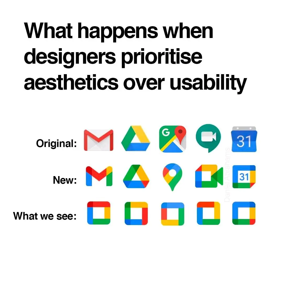
What's the font used in the heading? Is it some flavour of Helvetica?
It does not seem to have consistent kerning.
It certainly looks a lot like Helvetica. Probably could be any of these Helvetica clones:
I will also say that it feels a lot like Inter to me, which it's not as the i-dots aren't round, but maybe you'll enjoy that one anyways...
Probably Roboto.
Man... I might be showing my age, but checking out some of the links in these replies gave me nostalgia for the website FontsnThings.com (or was it "FontsandThings"?). I used to love browsing that shit as a kid and downloading all the coolest looking fonts lol
Anyone else?
My wife really really really wanted a MacBook in 2020 and the major plus of having it is that I got to steal all the fonts. Mostly, I just wanted Helvetica lol
Grotesk maybe. The curve of "h" doesn't seem to go high enough. Otherwise pretty close.