I happened to click a link that took me to the associated ~~twitter~~ X account for something I was interested in and was greeted by not one, not two, but four modern day web popups.
I know it's nothing new. I've got a couple of firefox plugins that are usually quite good at hiding this sort of nonsense, but I guess they failed me today (or, I shudder to think, there were even more that were blocked, and this is what got through)
What's the worst new/not-signed-in user experience you've encountered recently?
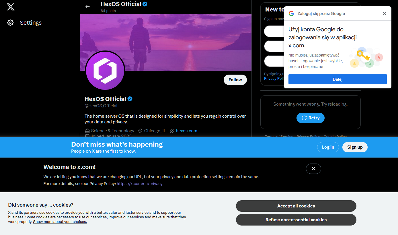
The absolute lack of any kind of consistency with layout or alignment makes me cringe too.
It's just shows how they're just glued onto the page with no care or planning. Especially no consideration to the user or user experience.
I've been saying the same for tv commercials. I've always hated them but they were built into the episodes, now they jump scare mid sentence and come back to another speaking.
I sail quite often but the wife likes the convenience, so.
It all sucks and getting suckier!
My guess is they're all built by different teams that didn't reuse any of the code written by the other teams. Ideally you're supposed to have a design system with standards for this, but I think all the good developers left (or were fired from) Twitter when Musk took over.
Yeah I agree
Oh I didn't even notice that, now I can't unsee it. Thanks (I hate it), I guess?