this post was submitted on 06 Aug 2024
119 points (94.7% liked)
memes
10308 readers
1697 users here now
Community rules
1. Be civil
No trolling, bigotry or other insulting / annoying behaviour
2. No politics
This is non-politics community. For political memes please go to [email protected]
3. No recent reposts
Check for reposts when posting a meme, you can only repost after 1 month
4. No bots
No bots without the express approval of the mods or the admins
5. No Spam/Ads
No advertisements or spam. This is an instance rule and the only way to live.
Sister communities
- [email protected] : Star Trek memes, chat and shitposts
- [email protected] : Lemmy Shitposts, anything and everything goes.
- [email protected] : Linux themed memes
- [email protected] : for those who love comic stories.
founded 1 year ago
MODERATORS
you are viewing a single comment's thread
view the rest of the comments
view the rest of the comments

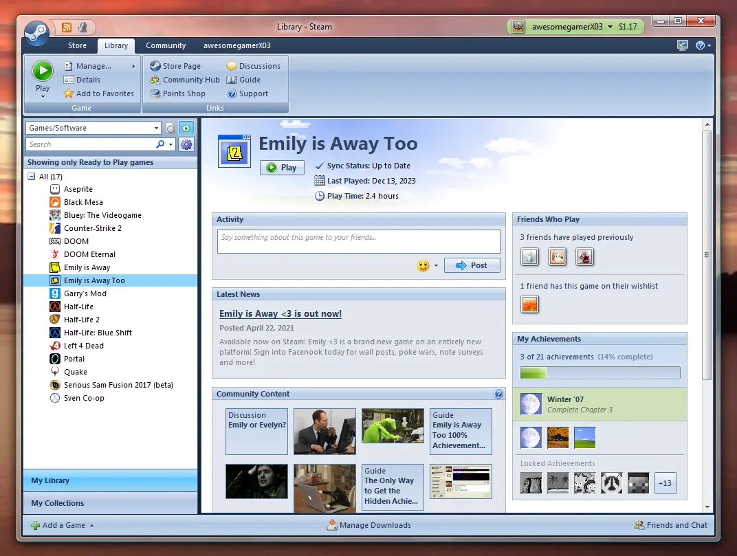
I know a lot of people love this aesthetic but it was my least favorite era for the UI. At least the look of it anyway.
Interesting, this happened to be one of my favorite looks for windows. It came across as comfortable and professional without looking like plastic or feeling sterile. A comfy medium between dark and light mode, and the glass window decorations were a nice little touch. If you don't mind me asking, what was it that you didn't like? Not looking for beef, just perspective.
Not the person you replied to, but for me it's not a happy medium, it's too far into the plastic-bubble aesthetic. Like a glassy, less colorful version of the baloony XP taskbar style.
Totally understandable, beauty being in the eye of the beholder and all. I appreciate the response, thank you