this post was submitted on 16 May 2024
22 points (100.0% liked)
pics
19568 readers
449 users here now
Rules:
1.. Please mark original photos with [OC] in the title if you're the photographer
2..Pictures containing a politician from any country or planet are prohibited, this is a community voted on rule.
3.. Image must be a photograph, no AI or digital art.
4.. No NSFW/Cosplay/Spam/Trolling images.
5.. Be civil. No racism or bigotry.
Photo of the Week Rule(s):
1.. On Fridays, the most upvoted original, marked [OC], photo posted between Friday and Thursday will be the next week's banner and featured photo.
2.. The weekly photos will be saved for an end of the year run off.
Instance-wide rules always apply. https://mastodon.world/about
founded 1 year ago
MODERATORS
you are viewing a single comment's thread
view the rest of the comments
view the rest of the comments


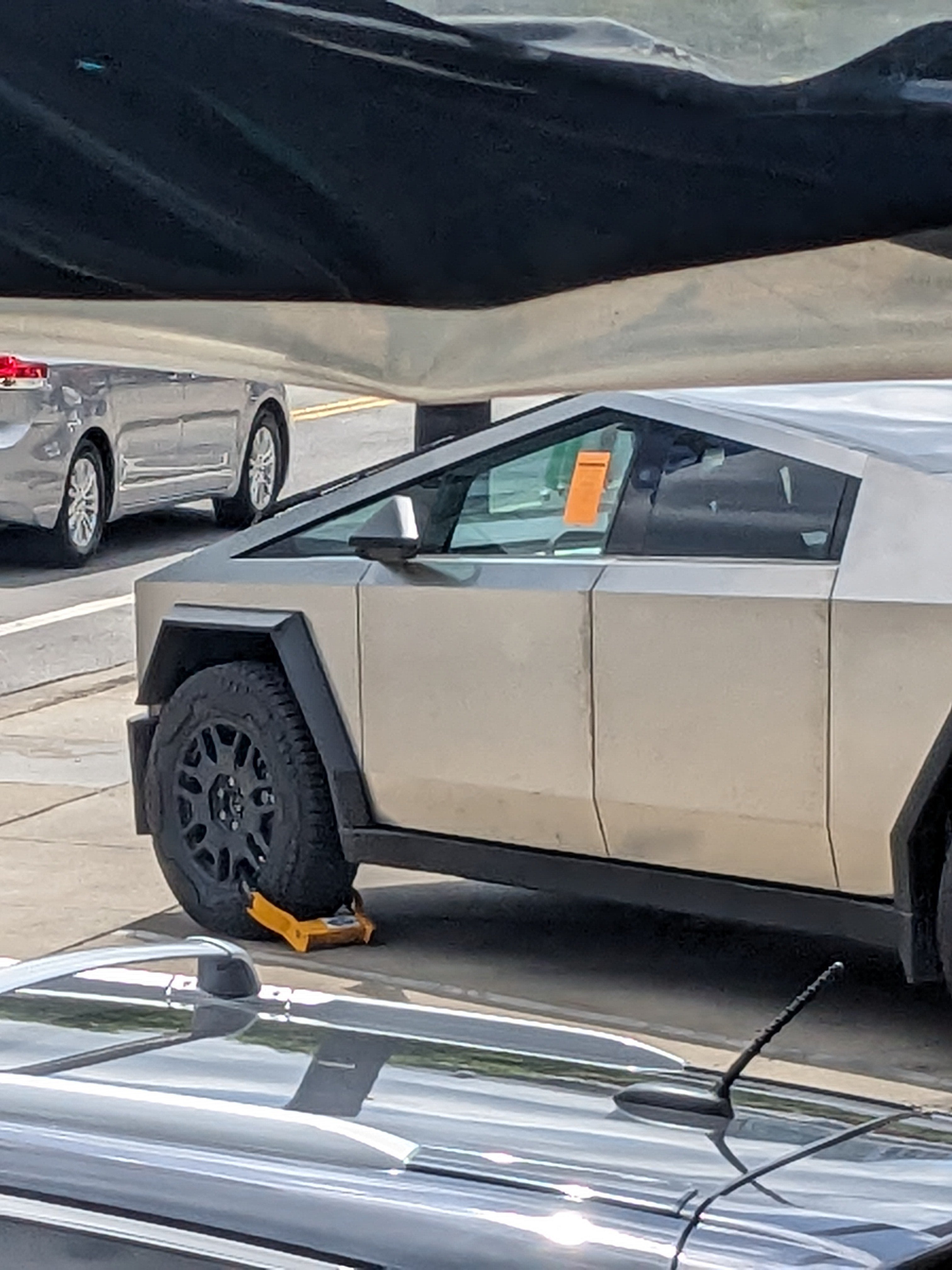
it might be the ugliest car ever made honestly, i urge people to find an uglier mass-produced car.
It is very close in ugliness to the Fiat Multipla https://wikipedia.org/wiki/Fiat_Multipla
Yeah, I know we're all shitting on Elon by proxy, but the multipla, Aztec, pt cruiser, Chevy SSR and plenty others are uglier.
I can see the Multipla being uglier than the Cybertruck because it looks like two differently-sized cars spliced together. However, there is no way I agree the PT Cruiser, Chevy SSR, and Aztec are uglier than the Cybertruck. Look at the Cybertruck again. It looks like a 10 year-old drew a truck on MS Paint using a mouse.
Taste is subjective so if someone doesn't like it that's valid.
For me, designs are successful based on the impression and experience they give people. The cyber truck to me gives off a futuristic vibe, it's intentional, it's a design that knows what it wants. Minimal polygons, minimal rounded edges. Uncommon material/finish. Visually striking, unique, memorable.
I think the Aztec isn't a good design because it wants to be futuristic but doesn't go far enough. Because it's trying to retain some traditional elements it looks like design by committee.
My impression is the pt cruiser and SSR were intended to be modern takes on retro/classy designs from say, the 50s. In the sense that they're curved they succeed, but the curves are in the wrong places and the curve radiuses are wrong. They look bubbly. They look like toys. The effect is amplified because they don't have a lot of the fine detail that was present on old cars.
I would take a PT cruiser over the cyber truck any day.
I would probably take a pt cruiser just because of the reputational risk of driving a cyber truck - that people will think you're an Elon stan. But purely from a looks perspective I think the cyber truck looks way better.
Bruh. Nobody can judge you for having bad taste if you don't point it out.
Rude
Facts don't care about your feelings, and the Incel Camino is objectively terrible looking. It's worse than what you'd get if you tasked a toddler with designing a truck and only gave them a short straight edge to draw with.
Aww. I kinda loved the SSR. It feels like a modern take on a vintage style.