this post was submitted on 13 Mar 2024
13 points (93.3% liked)
Vexillology
2139 readers
1 users here now
A community dedicated to flags and discussion about flags.
Other communities:
- Vexillologyjerk /c/[email protected]
founded 1 year ago
MODERATORS
you are viewing a single comment's thread
view the rest of the comments
view the rest of the comments


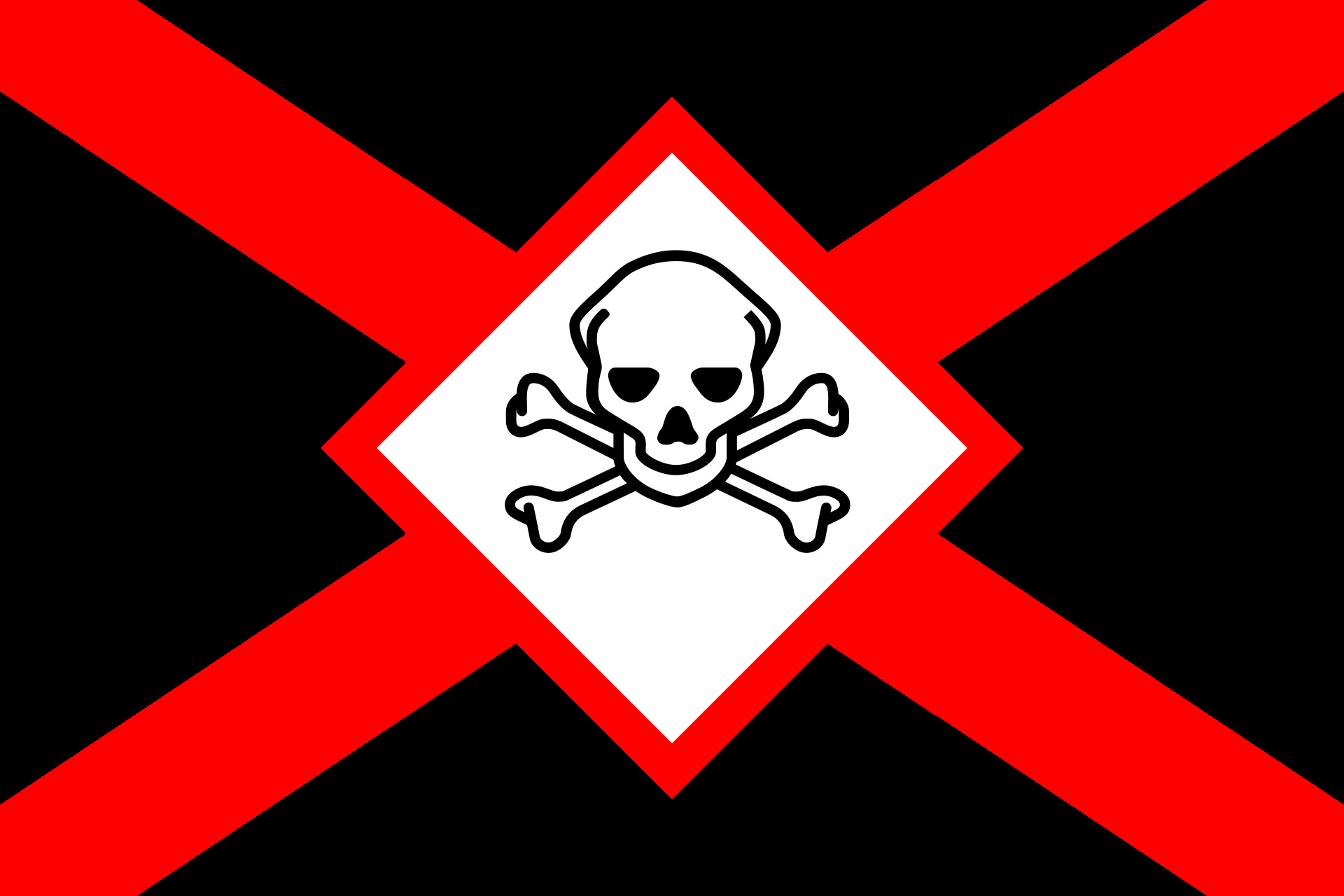
I prefer the first icon for the same reasons that snooggums brought up. It's simpler, its solid color fits the rest of the design better, and it's more widely applicable.