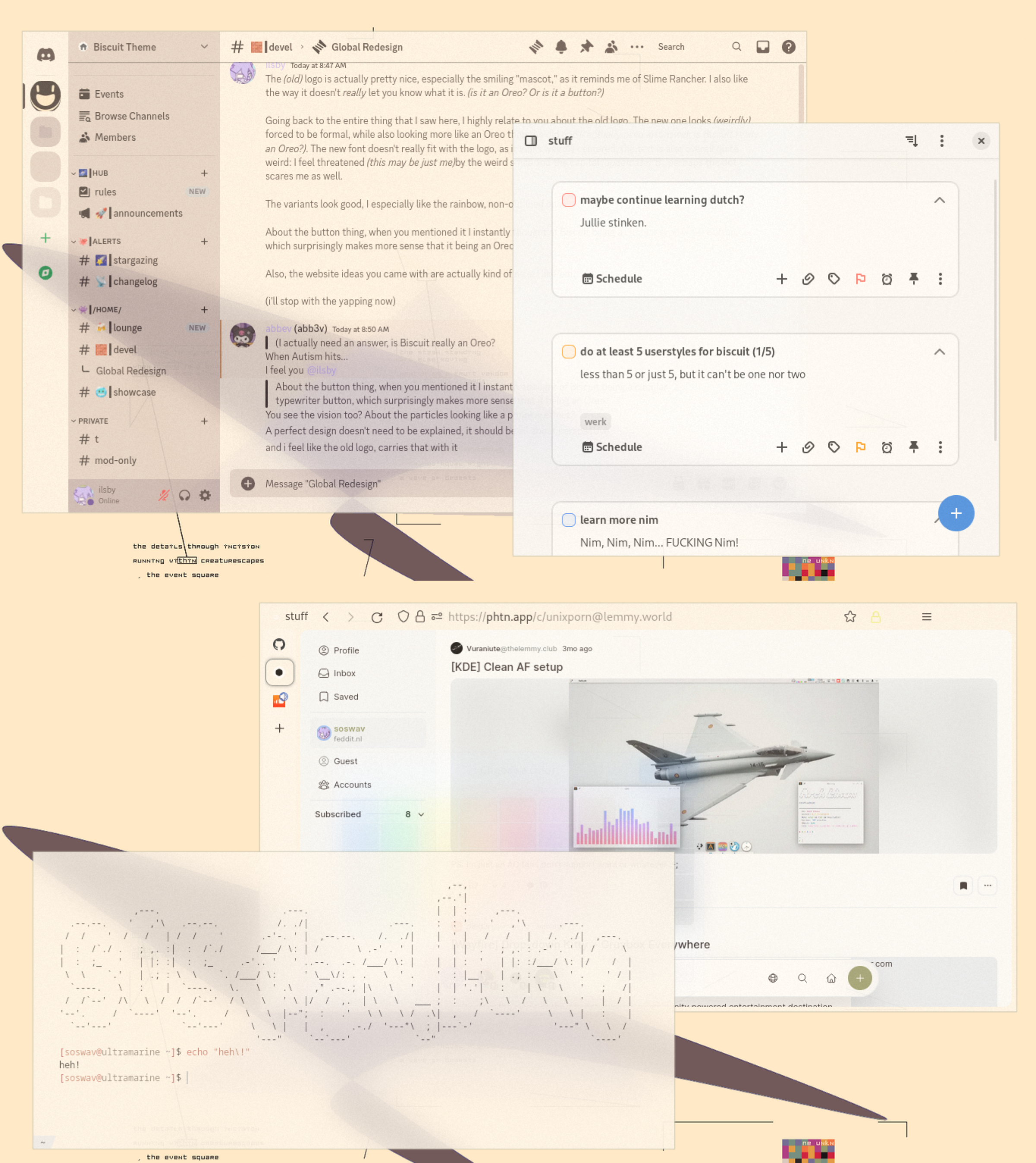
Pretty interesting theming, I must say
Unixporn
Unixporn
Submit screenshots of all your *NIX desktops, themes, and nifty configurations, or submit anything else that will make themers happy. Maybe a server running on an Amiga, or a Thinkpad signed by Bjarne Stroustrup? Show the world how pretty your computer can be!
Rules
- Post On-Topic
- No Defaults
- Busy Screenshots
- Use High-Quality Images
- Include a Details Comment
- No NSFW
- No Racism or use of racist terms
Ahh a light theme thats actually a theme and doesnt look like the dark theme just inverted. Very nice
thanjsk :-)
rare blur setup that both looks good and practical without being super tacky. What is the blur algo?
i'm just going to c+p the lines inside hyprland.conf
    blur {
        enabled      = true
        size         = 5   # 3 (def)
        passes       = 3   # 1 (def)
        noise        = 0.2 # 0.1 is good aswell
        popups       = true
    }
yes, i comment the defaults so i don't forget
uhh i have a dark ver one, but idk if to post it or not
Please do!


I like this more
I would have to agree. Both are very pleasing though.
Woah, this is really nice and cool. Was just browsing all on Lemmy and it showed up. I haven’t taken a dive into Linux, but I have dipped my toes in the last two decades, and dang it, I want to try it now.
The simplistic elegance that a nice theme can offer like this gives me peace and calm, and makes me feel welcome. Linux can be so intimidating, and many themes are harsh, this just makes the whole system seem approachable and friendly.
Looks fantastic, and saved for my future self!
if you switch, tell me! i want to know how it goes for you!
and also, thanks! means a lot, really!
So I just built myself a new computer, and I am running Nobara. So far, so good! I was wondering, how do I enable that biscuit theme? It looks like that Hyprland thing does not work for me. Sorry I am terribly a noob at Linux.
you need to either edit configuration files (these are mostly inside the .config/ directory, which is inside your profile (home) directory) or use graphical applications such as Gnome Tweaks for tweaking GTK themes and stuff
btw, you should probably ask in one of the Linux-related communities ([email protected], [email protected], [email protected] as examples) and don't take my word for this!!! i'm very dumb! (if you avoid this warning i will be forced to reply the best i possibly can)
Blinding Lights
This image makes me remember what a slut I am for transparency
...same
here's one i missed (this one was taken before all of the above, btw!)

What's the browser?
librewolf
Cursed technique
I don't like light themes because they can be too bright, even on lower brightness but this... I kinda like it. In fact, it reminds me of this Brodie Robertson video on Light Themes: https://www.youtube.com/watch?v=95dYgp3f-7w (I'm counting on the Piped bot to offer a more private way of playing the video)
TLDW: Modern Light themes are bad because they're blinding and too bright. A good light theme will not be just white but something that isn't as bright while still looking good and not blinding you.
Here is an alternative Piped link(s):
https://www.piped.video/watch?v=95dYgp3f-7w
Piped is a privacy-respecting open-source alternative frontend to YouTube.
I'm open-source; check me out at GitHub.
Good bot!
Looks great, nice job!
thanks! i appreciate that!

