Wuuttup. I'm here complaining again about Framework's Linux unfriendly display. The new one this time.
https://frame.work/products/display-kit?v=FRANJF0001
Old display, 2256 x 1504 (3:2)
GNOME
100% scale
- Nothing looks blurry
- Everything is tiny
- Unusable
100% scale + large text accessibility
- Nothing looks blurry
- Most apps scale appropriately
- Some apps don’t respect GNOME’s large text setting (Alacritty)
125% scale
- Most apps look blurry (Picard, Firefox, Spotify, Alacritty)
200% scale
- Everything is way too big
- Unusable
Plasma
100% scale
- Nothing looks blurry
- Everything is tiny
- Unusable
125% scale + Apply scaling themselves
- Nothing looks blurry
- Most apps scale appropriate
- Some apps can’t scale themselves and look tiny (Picard)
125% scale + Scaled by system
- Most apps look blurry (Picard, Firefox, Spotify, Alacritty)
200% scale
- Everything is way too big
- Unusable
New display, 2880 x 1920 (3:2)
GNOME
100% scale
- Nothing looks blurry
- Everything is tiny
- Unusable
100% scale + large text accessibility
- Nothing looks blurry
- Most apps scale appropriately
- Some apps don’t respect GNOME’s large text setting (Alacritty)
- Everything is tiny
150% scale
- Most apps look blurry (Picard, Firefox, Spotify, Alacritty)
200% scale
- Everything is way too big
- Unusable
Plasma
100% scale
- Nothing looks blurry
- Everything is tiny
- Unusable
150% scale + Apply scaling themselves
- Nothing looks blurry
- Some apps can’t scale themselves, but look a little better here? (Picard)
150% scale + Scaled by system
- Most apps look blurry (Picard, Firefox, Spotify, Alacritty)
200% scale
- Everything is way too big
- Unusable
tl;dr
In the old display, GNOME at 100% + large text was the best compromise. In the new display, Plasma at 150% + Apply scaling themselves is the best compromise.
Interestingly, Picard scaling itself looks super tiny in the old display, but in the new display it looks... better. It's still not correctly scaled like native Wayland apps, but it's better.
Warning
If you can't stomach moving from GNOME to Plasma, then 🚨 DO NOT BUY THE NEW DISPLAY 🚨. The new display is worse for GNOME.
Once again
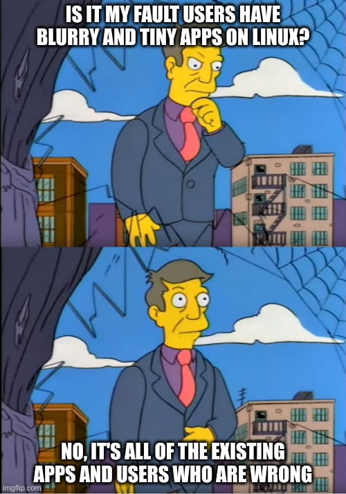
I am once again begging Framework to just give us a damn regular DPI display that works! Without workarounds. Without forcing users on specific DEs. Without forcing users to stop using their favorite apps. This new display has basically all of the flaws as the previous one.

Blurry apps come from xwayland compatibility. Firefox and alacritty (or other terminal like wezterm or kitty) have native wayland, with no blurry check Archwiki for example HiDPI. With Spotify, live with it or use spot (gtk client). Hopefully next gnome release incorporate something like plasma, and then ctrl+ native in spotify increase its size.
Or use spotify from the browser
I dunno why I hate web apps so much. But I found a Firefox extension that keeps me happy on my m2 Mac mini. Running asahi on it and it’s got all sorts of weird restrictions. https://addons.mozilla.org/en-US/firefox/addon/app-for-spotify/
This guy I love though.